Cara Faye Brochin
Wednesday, March 16, 2011
Sunday, February 13, 2011
Adopted Blog Critique

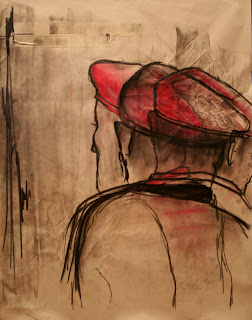
This piece demonstrates a variety of principles of design. First of all balance is created in this piece by the shadows and line work on the left side, while the man or "mime" is on the right. Emphasis is made with the red hat in the center of the piece which draws the viewers eye. However, the strong line work helps to carry the viewers eye throughout the piece creating movement. Also i was really drawn to this piece because the artist seems to be trying to recreate literal movement in the mans head, which i thought was really cool!
I think that the artist was trying to portray the jerky movements of a mime.
I think that the multiple views of shoulders and heads throughout the piece are working. Usually trying to make layered views like this could be to mushed together or look lost within each other. However, here I am able to see every point clearly and can really make out the different sides of the man as he moves.
I think that the only part that could use a little bit of work in this piece could be the shading. It seems as though some of the points of shadows are almost mistakes, like extra charcoal finger prints. Therefore, I guess what I am saying is that the craftsmanship could use a little touching up.
Wednesday, February 2, 2011
My Adopted Blog
I have chosen to adopt this blog because they seem to have a really wide variety of types of pieces and I am interested in seeing more! :)
http://lhsap2kelseyj.blogspot.com/
http://lhsap2kelseyj.blogspot.com/
Subscribe to:
Comments (Atom)


